「機械学習」というキーワードを検索すると、246,632の機械学習リポジトリが見つかりました。彼らはすべてこの業界に関係しているので、私は彼らの所有者が専門家であるか、少なくとも機械学習に十分な能力があることを期待していました。そこで、これらのユーザーのプロファイルを分析し、分析結果を表示することにしました。
私がどのように働いたか
ツール
私は3つのスクレイピングツールを使用しました:
- 機械学習でタグ付けされたすべてのリポジトリのURLを取得するための美しいスープ。これは、スクレイピングをはるかに簡単にするPythonライブラリです。
- PyGithub . Python- Github API v3. Github- (, , ..) Python-.
- Requests .
方法
私はすべてから遠く離れて解析しましたが、検索結果に表示された上位90のリポジトリの所有者と30人の最もアクティブな貢献者だけでした。


udacityのような組織の重複とプロファイルを削除した後、1208人のユーザーのリストを取得しました。それらのそれぞれについて、20の主要なパラメーターの情報を解析しました。
new_profile.info()

最初の13個のパラメーターはここから取得されました。

私がユーザーのリポジトリから取った残りの部分:
- total_starsすべてのリポジトリの合計スター
- max_starすべてのリポジトリのスターの最大数
- フォークすべてのリポジトリのフォークの総数
- 説明すべてのリポジトリのすべてのユーザーリポジトリからの説明
- 昨年の貢献数

データの視覚化
ヒストグラム
データをクリーンアップした後、それは最も興味深い段階であるデータの視覚化の番でした。これにはPlotlyを使用しました。
import matplotlib.pyplot as plt
import numpy as np
import plotly.express as px # for plotting
import altair as alt # for plotting
import datapane as dp # for creating a report for your findings
top_followers = new_profile.sort_values(by='followers', axis=0, ascending=False)
fig = px.bar(top_followers,
x='user_name',
y='followers',
hover_data=['followers'],
)
fig.show()
これ が起こったことです。
ヒストグラムは、フォロワーが100人未満のユーザーのテールが非常に長いため、少し扱いにくいため、スケールアップすることをお勧めします。

ご覧のとおり、llSourcell(Siraj Raval)のフォロワーが最も多い(36261)。2番目に人気のあるフォロワーは3分の1です(12682)。
先に進むと、プロファイルの1%がすべてのフォロワーの41%を獲得していることがわかります。
>>> top_n = int(len(top_followers) * 0.01)12>>> sum(top_followers.iloc[0: top_n,:].loc[:, 'followers'])/sum(top_followers.followers)0.41293075864408607
次に、対数目盛を使用して、total_stars、max_star、フォークに関する情報を視覚化します。
figs = [] # list to save all the plots and table
features = ['followers',
'following',
'total_stars',
'max_star',
'forks',
'contribution']
for col in features:
top_col = new_profile.sort_values(by=col, axis=0, ascending=False)
log_y = False
#change scale of y-axis of every feature to log except contribution
if col != 'contribution':
log_y = True
fig = px.bar(top_col,
x='user_name',
y=col,
hover_data=[col],
log_y = log_y
)
fig.update_layout({'plot_bgcolor': 'rgba(36, 83, 97, 0.06)'}) #change background coor
fig.show()
figs.append(dp.Plot(fig))
それは判明し 、このように。
結果として得られる画像は、ジップの法則による分布に非常に近いものです。自然言語における単語の頻度の分布の経験的パターンについて話している:言語のすべての単語がそれらの使用頻度の降順で順序付けられている場合。ここでも同様の依存関係があります。
相関関係
しかし、主要なデータポイント間の依存関係についてはどうでしょうか。そして、これらの依存関係はどのくらい強いのでしょうか?私はこれを理解するためにscatter_matrixを使用しました。
correlation = px.scatter_matrix(new_profile, dimensions=['forks', 'total_stars', 'followers',
'following', 'max_star','contribution'],
title='Correlation between datapoints',
width=800, height=800)
correlation.show()
corr = new_profile.corr()
figs.append(dp.Plot(correlation))
figs.append(dp.Table(corr))
corr
それは判明し 、このようにして 上のよう。
最も強い正の関係は、次の間に形成されます。
- 星の最大数と星の総数(0.939)
- フォークと総星(0.929)
- フォークの数とフォロワーの数(0.774)
- フォロワーと合計スター(0.632)
プログラミング言語
GitHubプロファイルの所有者の間で最も一般的なプログラミング言語を見つけるために、いくつかの追加の分析を行いました。
# Collect languages from all repos of al users
languages = []
for language in list(new_profile['languages']):
try:
languages += language
except:
languages += ['None']
# Count the frequency of each language
from collections import Counter
occ = dict(Counter(languages))
# Remove languages below count of 10
top_languages = [(language, frequency) for language, frequency in occ.items() if frequency > 10]
top_languages = list(zip(*top_languages))
language_df = pd.DataFrame(data = {'languages': top_languages[0],
'frequency': top_languages[1]})
language_df.sort_values(by='frequency', axis=0, inplace=True, ascending=False)
language = px.bar(language_df, y='frequency', x='languages',
title='Frequency of languages')
figs.append(dp.Plot(language))
language.show()
したがって、上位10言語には次のものが含まれます:
- Python
- JavaScript
- HTML
- Jupyter Notebook
- シェルなど
ロケーション
プロファイルの所有者が世界のどの地域にいるのかを理解するには、次のタスクを実行する必要があります-ユーザーの場所を視覚化します。分析されたプロファイルの中で、地理は31%を示しています。視覚化には、geopy.geocoders.Nominatimを使用します
from geopy.geocoders import Nominatim
import folium
geolocator = Nominatim(user_agent='my_app')
locations = list(new_profile['location'])
# Extract lats and lons
lats = []
lons = []
exceptions = []
for loc in locations:
try:
location = geolocator.geocode(loc)
lats.append(location.latitude)
lons.append(location.longitude)
print(location.address)
except:
print('exception', loc)
exceptions.append(loc)
print(len(exceptions)) # output: 17
# Remove the locations not found in map
location_df = new_profile[~new_profile.location.isin(exceptions)]
location_df['latitude'] = lats
location_df['longitude'] = lons
それでは、マップを作成するには、Plotlyのscatter_geoを使用します
# Visualize with Plotly's scatter_geo
m = px.scatter_geo(location_df, lat='latitude', lon='longitude',
color='total_stars', size='forks',
hover_data=['user_name','followers'],
title='Locations of Top Users')
m.show()
figs.append(dp.Plot(m))
このリンクによる と、ズーム付きの元の地図が利用可能です。
レポおよびバイオユーザーの説明
多くのユーザーは、リポジトリの説明を残し、独自の経歴も提供します。これらすべてを視覚化するために、W ordCloudを使用します !Python用。
import string
import nltk
from nltk.corpus import stopwords
from nltk.tokenize import word_tokenize
from nltk.stem import WordNetLemmatizer
from nltk.tokenize import word_tokenize
from wordcloud import WordCloud, STOPWORDS
import matplotlib.pyplot as plt
nltk.download('stopwords')
nltk.download('punkt')
nltk.download('wordnet')
def process_text(features):
'''Function to process texts'''
features = [row for row in features if row != None]
text = ' '.join(features)
# lowercase
text = text.lower()
#remove punctuation
text = text.translate(str.maketrans('', '', string.punctuation))
#remove stopwords
stop_words = set(stopwords.words('english'))
#tokenize
tokens = word_tokenize(text)
new_text = [i for i in tokens if not i in stop_words]
new_text = ' '.join(new_text)
return new_text
def make_wordcloud(new_text):
'''Function to make wordcloud'''
wordcloud = WordCloud(width = 800, height = 800,
background_color ='white',
min_font_size = 10).generate(new_text)
fig = plt.figure(figsize = (8, 8), facecolor = None)
plt.imshow(wordcloud)
plt.axis("off")
plt.tight_layout(pad = 0)
plt.show()
return fig
descriptions = []
for desc in new_profile['descriptions']:
try:
descriptions += desc
except:
pass
descriptions = process_text(descriptions)
cloud = make_wordcloud(descriptions)
figs.append(dp.Plot(cloud))

そしてバイオについても同じ
bios = []
for bio in new_profile['bio']:
try:
bios.append(bio)
except:
pass
text = process_text(bios)
cloud = make_wordcloud(text)
figs.append(dp.Plot(cloud))
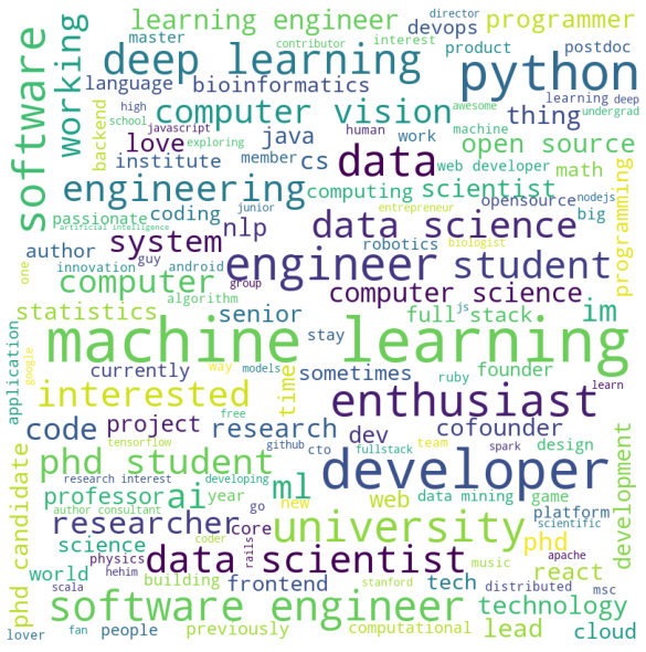
ご覧のとおり、キーワードは機械学習のスペシャリストに期待できるものと完全に一致しています。
調査結果
データは、主要な「機械学習」に最適な90のリポジトリのユーザーと作成者から受信されました。ただし、すべてのトッププロファイルの所有者が機械学習の専門家によってリストに含まれているという保証はありません。
それでも、この記事は、収集されたデータをクリーンアップして視覚化する方法の良い例です。ほとんどの場合、結果はあなたを驚かせるでしょう。データサイエンスはあなたの知識を応用して周囲を分析するのに役立つので、これは奇妙なことではありません。
必要に応じて、この記事のコードをフォークして、好きなように実行できます。 これがレポです</ a。
, Data Science AR- Banuba - Skillbox.
, «» github- . , , ..
:
1) , , . ( , 'contribution'). , .
'contribution' , . .
, , . , , ().
2) , . , . , , . , , - . ( ), - , , .
: , . .